Enhacing UX & creating new features for Virginia.io
Today, businesses seek new ways to improve and grow. Evaluating vendors is crucial for finding the right suppliers. Virginia, a B2B platform, helps with this process. As a product designer, I improved Virginia's user experience and added features to set it apart from competitors. This case study explores my design journey, the problems I faced, and the results of my work.
The platform's user experience has many problems, making it confusing and inefficient to navigate.
The Problem
Increase free trial conversions to paid subscriptions and add a feature for users to handle vendors, payments, and contracts.
Business Goal
Efficiently use the platform to choose vendors for business needs, making sure to decide wisely.
User Goal
Our team used research like heat maps, screen recordings, user data, and feedback to find problems and shape our design. This approach helped us see what users wanted and areas needing improvement. By tackling these issues, we boosted the platform's performance, user happiness, and sales.
Research & Insights
We started planning by making a map to organize the website layout. This made sure the site was easy to understand and navigate. The map also helped team communication and showed how the website is structured. It was crucial for making a user-friendly site and working well with our engineer.
Redesigning with User Flows
I created a design system that kept the brand's look, including colors and fonts. The icons were updated for clarity, text sizes were reduced for consistency, improving user experience. This uniformity made navigation easier, streamlined design and development, preventing confusion as the platform expanded.
Creating a Design System
Data like reports and vendor searches are now on the main page of the updated dashboard. We used screen recordings to make decisions based on how long users took to do tasks and move around the site. The main dashboard was redesigned to make data easier to see, navigation simpler, and help users feel more confident in finishing tasks. We labeled the icons in the navigation bar clearly for easier use. Our designs work for different users and learning styles, keeping things the same while improving the brand.
Redesigning the Dashboard
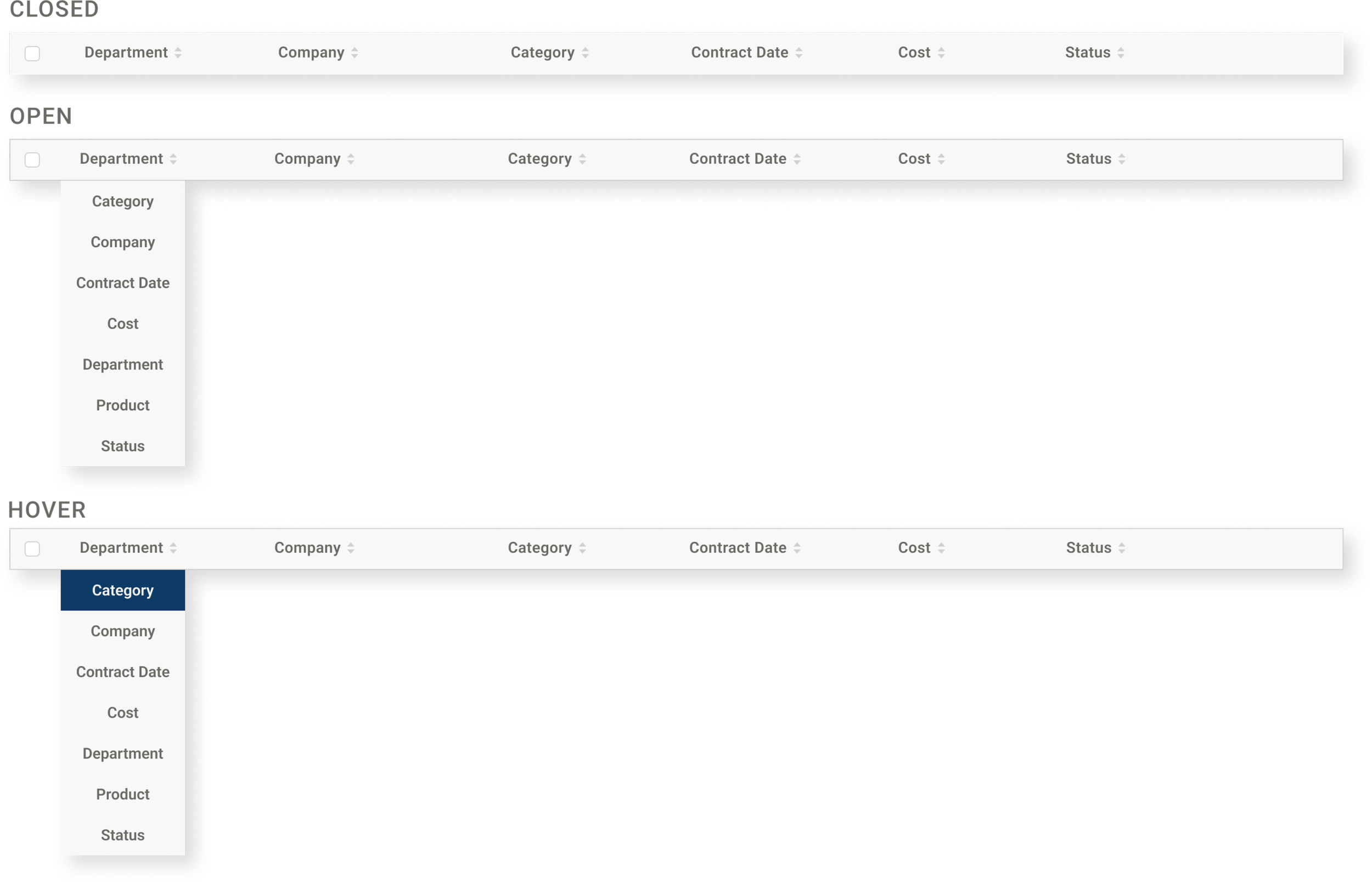
Virginia's vendor management feature centralizes vendor information and aims to enhance communication, collaboration, and decision-making for teams. Users can maintain compliance, save time and costs, and improve vendor relationships through efficient project management. The table format allows users to track key information and upload vital documents, with customizable columns and status tracking for a personalized experience.
Creating New Features
Final design includes a main button on the top right to add new vendors. A secondary button on the bottom left lets users export vendor info to Excel, aiding in data analysis, report generation, and sharing outside the platform.
The Outcome
4.5
New designs averaged a 4.5/5 rating in user surveys
70
Improvement of overall user satisfaction with net promoter score of 70
20
20% decrease in time to complete tasks


