
Redesigning The Wig Co. Website
The Wig Company is one of four brands that falls under HairUWear.
The project began with an analysis of the existing website. I reviewed analytics data, assessed site performance, evaluated the mobile experience, and conducted a content audit to pinpoint issues and areas for optimization.
I then performed an accessibility audit, ensuring that the website was legally compliant, inclusive, usable, and accessible to a wide range of users. Additionally, a competitive analysis of industry-leading wig websites was conducted to gain insights and identify opportunities for improvement.
Research & Discovery

Based on the client's requirements, two customer personas were developed representing current and potential future clients: a 65-year-old woman with moderate income, and a 45-year-old woman from an upper-class background.


User Flows
User journey maps were created for several scenarios, including participating in a quiz, using the virtual try-on feature, scheduling an appointment, requesting a free sample swatch, navigating the product page and checkout process, and selecting a specific color or texture. However, we focused first on the checkout process and primary screens including homepage, PLP, PDP, and cart drawer.

Next, I developed low-fidelity sketches of the proposed design changes. These sketches helped visualize and communicate initial ideas, gather early feedback, identify potential usability issues, and iterate quickly.

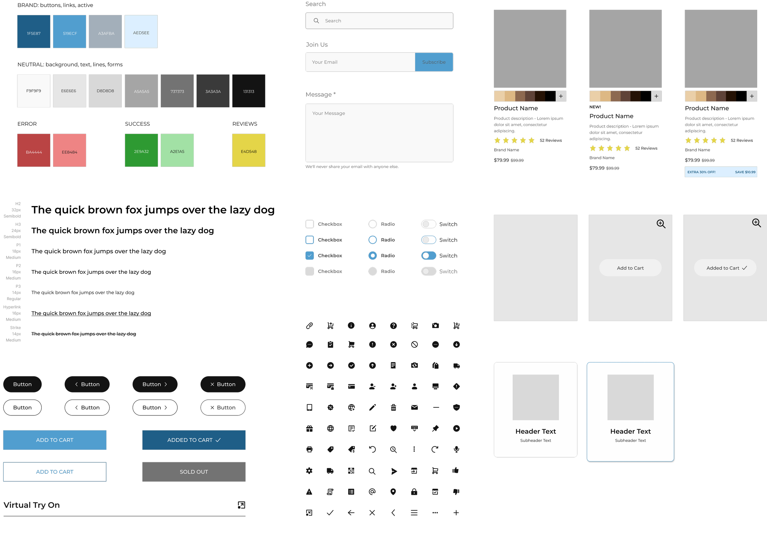
Developing a Design System
During the design system development phase, I laid a solid foundation by integrating the brand's unique identity into the design, including color palette and custom iconography. I created a component library, featuring elements such as product cards, buttons, form fields, and navigation bars, all aimed at maintaining a consistent look and behavior across the site.
I also designed reusable elements like grids, spacing, and typography rules (known as design tokens) that ensured a uniform application of design standards across the board. To wrap it all up, I compiled a thorough style guide that documented this design system, providing a valuable reference for any future design decisions.
Using Figma, these final visual and interactive mockups came to life. They were made with a strong emphasis on our design system, utilizing its principles, guidelines, and reusable components to ensure unity across the design.
The user flows were key in this phase as they were incorporated into the high-fidelity designs, facilitating a user-centered and intuitive navigation experience. I also used the feedback from the low-fidelity sketches to refine the design, identify potential usability issues, and areas for improvement. To round it all off, I ended up with a comprehensive set of high-resolution, interactive designs that acted as a detailed blueprint for website development.
Hi-fi Designs

Testing & Iterations
Method: Remote usability test conducted with four experienced ecommerce shoppers and wig buyers (aged 50-70) via Zoom.
Key Strengths:
Clean, minimalistic design
User-friendly interface
Clear navigation and filters
Inclusion of testimonials
Options to shop by lifestyle/need
Multimedia elements for engagement
Clear product categories
Variety of product photos
Color filter options for wigs
Straightforward cart drawer
Areas of Improvement & Proposed Solutions:
Increase information "above the fold."
Enhance visibility of "add to cart" button and review stars.
Improve visibility of virtual try-on feature.
Make "reviews" link lead to the reviews section.
Wig image color change with swatch selection on PDP.
Simplify PLP swatches.
Improve scrolling mechanism on the right side of PDP.
Next Steps: Implement participant feedback for iterative design improvements, enhancing the user experience and shopping efficiency on the site.

New Features
1. Find a Wig Quiz: An interactive tool for new users, assisting product discovery. Based on user responses, it generates personalized wig recommendations, reducing decision-making time.
2. Virtual Try-On Feature: Implemented to simulate an in-store experience. It uses augmented reality, allowing users to try on wigs virtually. Its visibility was enhanced based on usability test feedback.
3. Request Color Swatches: Allows customers to order physical color swatches, enabling accurate color choice before purchasing. This offers a tactile and visual experience, boosting user confidence.
These features aim to enhance user experience, mimicking in-store benefits in an online environment. The focus is on user satisfaction and confidence, aiming to increase repeat purchases.
Engineering Collaboration
In the final stages, I created an interactive prototype in Figma, ensuring both aesthetic appeal and smooth user experience. Post rigorous testing, we presented the prototype to stakeholders for feedback.
What set this project apart was the collaborative handoff process with the development team. It wasn't just about delivering documentation but engaging in regular, in-depth discussions to navigate design specs and potential limitations.
We held frequent meetings to jointly review design assets, animations, and responsive design requirements. With a shared goal of an inclusive, user-friendly site, we also discussed and documented accessibility guidelines.
This collaboration ensured the design seamlessly transitioned into development, maintaining its intended user experience and visual appeal.
The Outcome
The project for The Wig Company was finished on schedule with top-notch work. Services included checking accessibility, studying competitors, creating user profiles and journey maps, making simple sketches, developing a design system, and crafting detailed designs. With a thorough usability test report and refinements, we built a stunning prototype in Figma and provided in-depth instructions for developers. The redesign improved the website's ease of use and appeal, boosting sales and highlighting our strong design and project skills.